
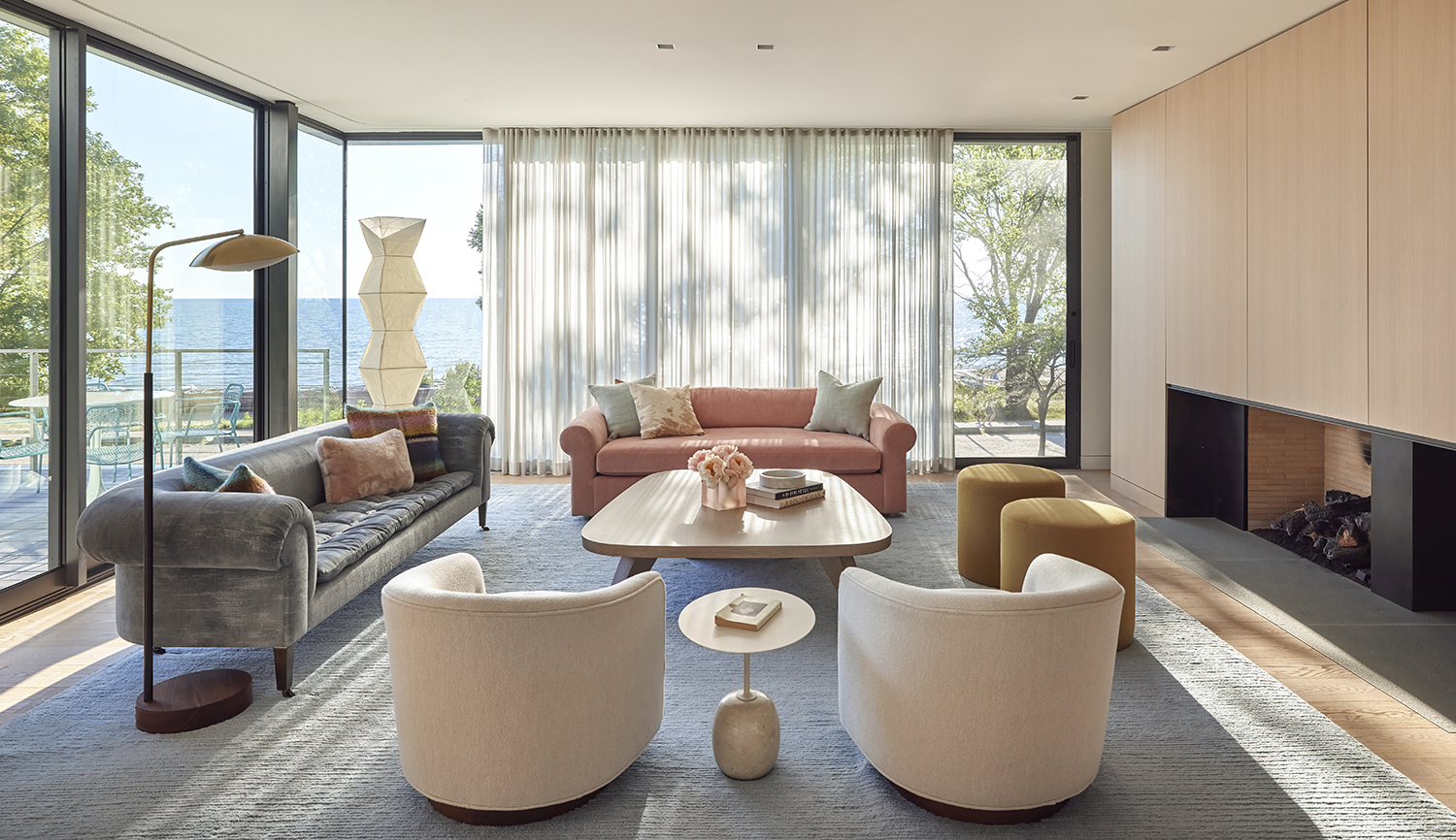
You can spend a small fortune on a sofa, choose beautiful lighting, invest in a spectacular rug, and still have a room that somehow feels unfinished. Often, the culprit is above your head.
Window treatments have an enormous influence on how a room looks and feels, yet they are surprisingly easy to get wrong. A curtain that stops too high, a shade that is poorly proportioned, or fabric that feels too flimsy for the room can undermine an otherwise beautifully designed interior.
The good news is that creating a more polished look does not necessarily require expensive materials. It is often about getting the details, proportions, and placement right.
Here are some of the most common window treatment mistakes that can make a room look less expensive, along with the designer-approved fixes.
1. Hanging Curtains Too Low
Perhaps the most common mistake is mounting the curtain rod immediately above the window frame. It seems logical. The window is there, so the curtain hardware goes there. But from a design perspective, this can make the entire room feel shorter.
Instead, consider mounting the rod higher, sometimes much closer to the ceiling. The eye follows the vertical line of the fabric, making the windows appear taller and the ceiling feel more generous.
This is particularly effective in rooms with standard ceiling heights, where every visual inch matters. The same principle applies to the width. Extending the rod beyond the window frame can make the opening appear wider while allowing the curtains to stack away from the glass.
2. Choosing Curtains That Are Too Short
Nothing makes a beautifully decorated room look quite as awkward as curtains that stop several inches above the floor.
Unless you are deliberately using a short treatment for architectural or practical reasons, full-length custom curtains generally create a more elegant effect. Ideally, the fabric should either just kiss the floor or have a carefully considered break.
This is one area where custom curtains can make a significant difference. Instead of trying to make a standard length work, the curtains can be made specifically for the height of the room and the way you want the fabric to fall. A few inches can transform the entire appearance of the window.
3. Using Too Little Fabric
Thin, skimpy curtains rarely look luxurious. Even a beautiful fabric can lose its impact if there is not enough of it to create attractive folds.
Fullness gives curtains volume and movement. It allows the fabric to stack gracefully when open and creates a richer appearance when closed. The right amount depends on the fabric, heading style, and whether the curtains are primarily decorative or intended to cover the entire window.
For a formal living room or bedroom, generous fullness can create a particularly sophisticated effect. And if you are investing in custom drapes, it is worth discussing fullness as carefully as you discuss fabric and color.
4. Treating Every Window the Same Way
Consistency is useful in interior design. Uniformity is not always necessary.
A living room window does not necessarily need the same treatment as a kitchen window simply because they are in the same house. Different rooms have different requirements. A kitchen may benefit from a practical roman shade. A living room might deserve floor-length drapery. A bedroom could benefit from blackout lining and layered treatments.
Think about what each room needs rather than applying one formula everywhere. A cohesive home is not one where every window looks identical. It is one where every window feels like it belongs.
5. Choosing the Wrong Scale
A window treatment can be beautiful in isolation and completely wrong for the room. Heavy velvet curtains in a tiny breakfast nook may overwhelm the space. Delicate curtains across an enormous living room window can look underwhelming.
Scale matters. The size of the window, height of the ceiling, dimensions of the furniture, and overall visual weight of the room should all influence your choice.
Large rooms can generally accommodate more substantial fabrics and generous drapery. Smaller rooms often benefit from lighter fabrics and cleaner silhouettes. The goal is proportion, not simply prettiness.
6. Making Everything Match Too Perfectly
Matching curtains, roman shades, cushions, upholstery, and wallpaper may sound coordinated. In practice, it can sometimes make a room feel more like a showroom than a thoughtfully collected interior. The more sophisticated approach is to coordinate rather than match.
For example, a plain roman shade can provide a quiet backdrop for patterned curtains. Alternatively, a patterned shade can be paired with solid drapes. Look for shared colors, complementary textures, or related motifs instead of identical fabrics. A little variation gives the room depth.
7. Ignoring the Fabric’s Texture
Color tends to get all the attention, but texture is often what makes a window treatment feel expensive.
Linen introduces natural variation and softness. Velvet brings depth and subtle sheen. Woven fabrics can add dimension without introducing a strong pattern. Even a simple neutral shade can look extraordinary when the fabric has an interesting surface.
This is particularly important in rooms with restrained color palettes. When there are fewer colors competing for attention, texture has more opportunity to shine. Think about how the fabric will look in daylight, how it will fall into folds, and how it will interact with nearby upholstery and rugs.
8. Choosing Gray Without Considering Its Undertone
Gray is one of the most versatile colors for window treatments, but it is also one of the easiest to get wrong. A gray that looks neutral in a showroom may suddenly appear blue, green, or beige once it is inside your home.
Gray window roman shades can be incredibly sophisticated, but their undertones need to work with the rest of the room. Warm grays pair naturally with beige, cream, taupe, natural wood, and warm metals. Cooler grays tend to work better with crisp whites, blue, silver, and cooler contemporary palettes.
Always view your fabric sample alongside your walls and furnishings, preferably at different times of day. Your windows will tell you the truth eventually.
9. Blocking Too Much Natural Light
Heavy window treatments can certainly create drama, but there is such a thing as too much coverage. If your room is already short on natural light, covering the entire window with a dark, opaque treatment can make it feel smaller and heavier.
This is where sheer roman shades can be particularly useful. They filter sunlight while preserving the brightness of the room, creating a softer atmosphere without completely closing off the window.
Sheer curtains can provide a similar effect. For rooms where privacy and darkness are essential, consider layering instead of relying on one heavy treatment. You can have a lighter daytime layer and a more substantial treatment for the evening.
10. Forgetting About the Lining
The front of a window treatment gets all the attention. The lining is doing a surprising amount of work behind the scenes. The right lining can affect light control, privacy, insulation, durability, and even the way the fabric hangs. Bedrooms may benefit from blackout or room-darkening lining. Living rooms might work better with a light-filtering option. Delicate fabrics may require additional protection from sunlight.
Lining should be considered part of the design rather than an afterthought. A beautiful fabric with the wrong lining may never look or function the way you intended.
11. Installing Roman Shades Without Considering the Mount
Roman shades can be mounted inside or outside the window frame, and the choice can change the entire appearance.
An inside mount creates a neat, architectural look and allows decorative trim around the window to remain visible. An outside mount can make a window appear larger because the shade extends beyond the opening. Neither is universally better. The decision should depend on the architecture, depth of the window frame, available wall space, and visual effect you want.
This is another reason custom roman shades can be worthwhile. You can design the treatment around the window rather than trying to make the window accommodate a predetermined size.
12. Overlooking the Hardware
Hardware might seem like a minor detail. It isn’t.
A flimsy rod supporting substantial drapes can immediately make the treatment look less considered. Conversely, well-proportioned hardware can make even simple curtains feel intentional.
Think about the finish as well. Black hardware can create a crisp contemporary contrast. Brass can introduce warmth. A simple metal rod can recede into the background when the fabric is intended to be the star. The hardware should support the design rather than compete with it.
13. Treating Curtains as an Afterthought
Perhaps the biggest mistake is waiting until the very end of the decorating process to think about the windows. By then, the furniture may be positioned incorrectly, artwork may occupy the ideal curtain wall, or there may not be enough room for the treatment you actually want. Window treatments should be considered alongside the major architectural and furniture decisions.
Where will the rod go? How much wall space is available? Will the curtains interfere with furniture? Do the windows need privacy? How will sunlight move through the room? Answering these questions early makes the final result considerably more seamless.
14. Forgetting That Windows Can Add Architecture
A window treatment is not simply something you put over glass. It can actually change how the architecture is perceived. Long curtains can make ceilings appear higher. Wide treatments can make narrow windows feel broader. Roman shades can emphasize clean horizontal lines. Layered treatments can give a plain wall greater depth.
Use the treatment to correct or enhance the proportions of the room. Sometimes the best window treatment is the one that makes the room’s architecture look better than it actually is.
The Most Expensive-Looking Rooms Are Rarely About Price
There is a reason some rooms feel luxurious without being filled with obviously expensive things. The proportions are right. The fabrics have texture. The colors relate to one another. The curtains reach the floor. The hardware feels appropriate. The window treatments suit the architecture rather than fighting it.
In other words, luxury often comes down to precision. You do not necessarily need the most elaborate fabric or the most dramatic treatment. You need a window treatment that feels as though it was designed specifically for the room.
Get the basics right: hang curtains high, give them enough fullness, choose fabrics with depth, consider the lining, respect the scale of the room, and let different elements coordinate rather than match perfectly.
The result will not simply make your windows look better. It will make the entire room feel more intentional. And that, more than any price tag, is what gives an interior its expensive-looking finish.


